BigOven - Product Redesign
01 - Understanding the problem
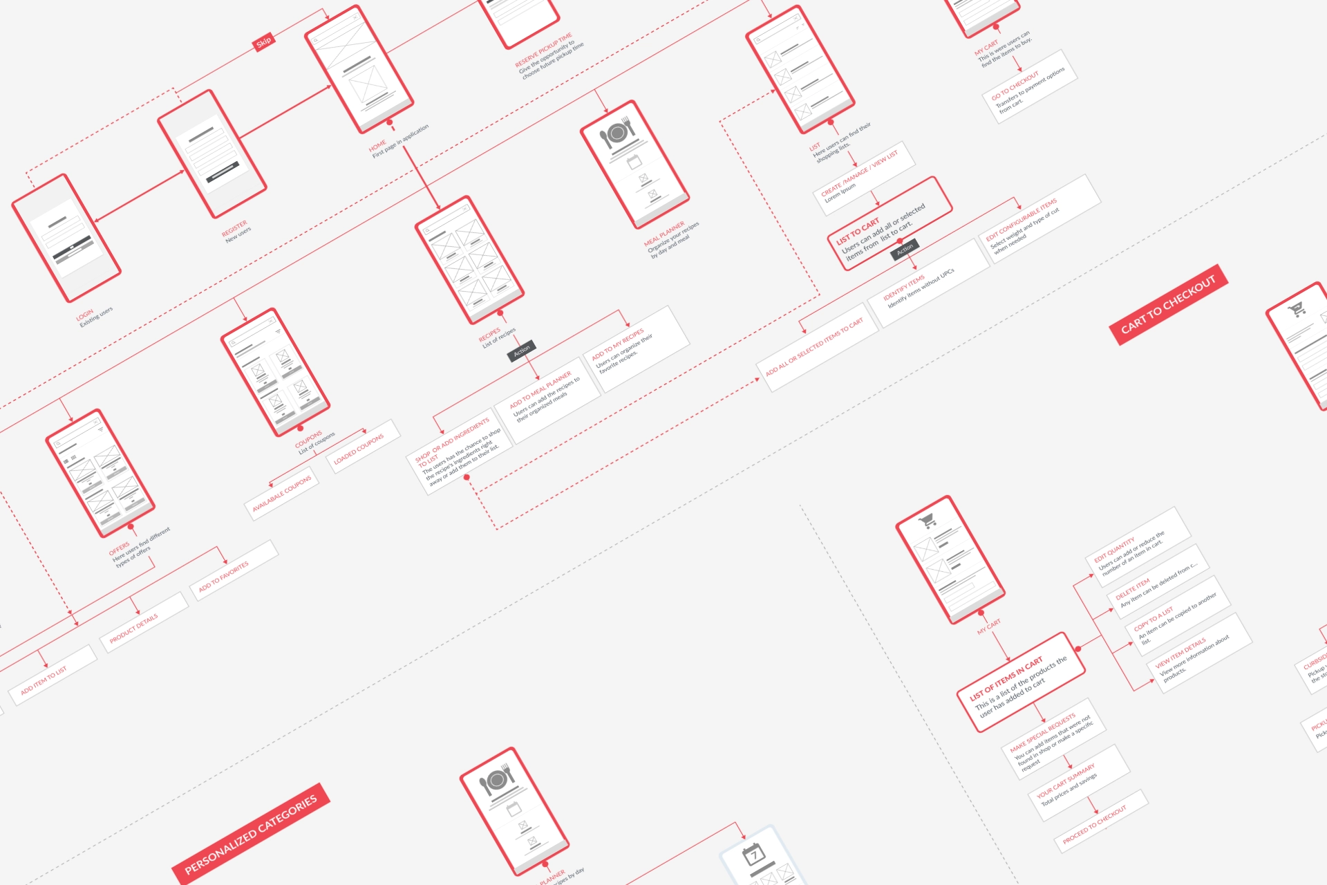
Before redesigning individual screens, I reviewed the product as a whole using App Store reviews, customer-support feedback, competitor research and existing product knowledge to identify recurring usability issues. I mapped the relationships between key areas of the experience and created updated user flows and a sitemap, revealing where navigation had become fragmented and where related tasks could be brought closer together.
02 - Simplifying the experience
Clarifying navigation
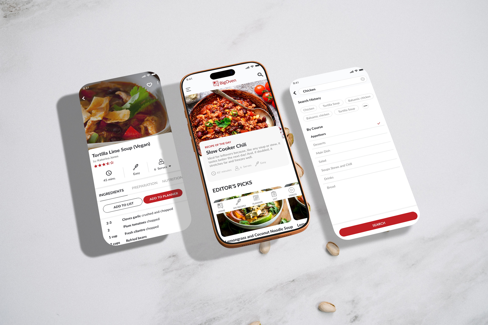
Navigation was reorganised to give search, saved recipes and planning tools clearer roles within the product.
Improving discovery
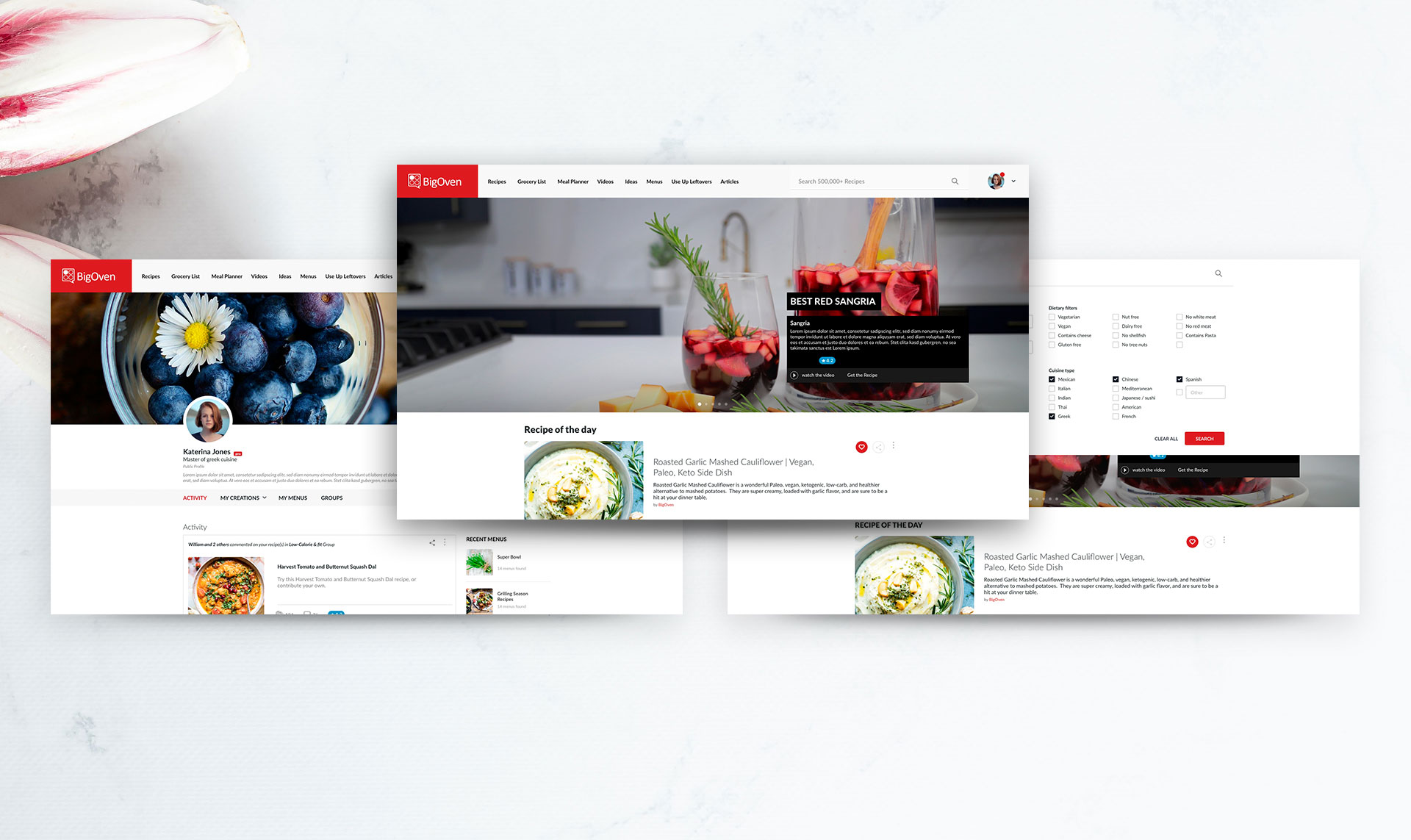
Search was treated as a broader experience, with improved sorting, filtering and information hierarchy to help users find relevant recipes more easily.
Reducing complexity in planning tools
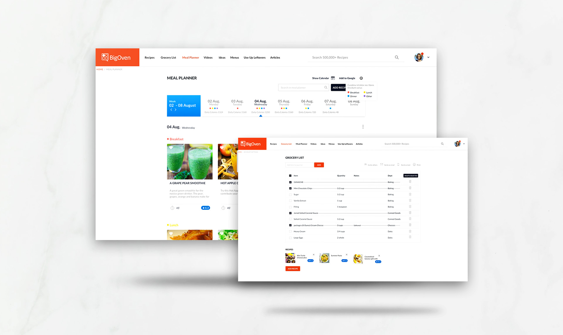
The Meal Planner and Grocery List were restructured to create stronger hierarchy, make key actions easier to identify and reduce visual complexity.
03 - Key Designing Decisions
Bringing related tasks together
Recipe discovery, saved content, planning and grocery tasks were treated as connected parts of the same experience rather than separate areas.
Creating clearer hierarchy
Information-heavy screens were simplified through grouping, prioritisation and more consistent interaction patterns.
Designing across platforms
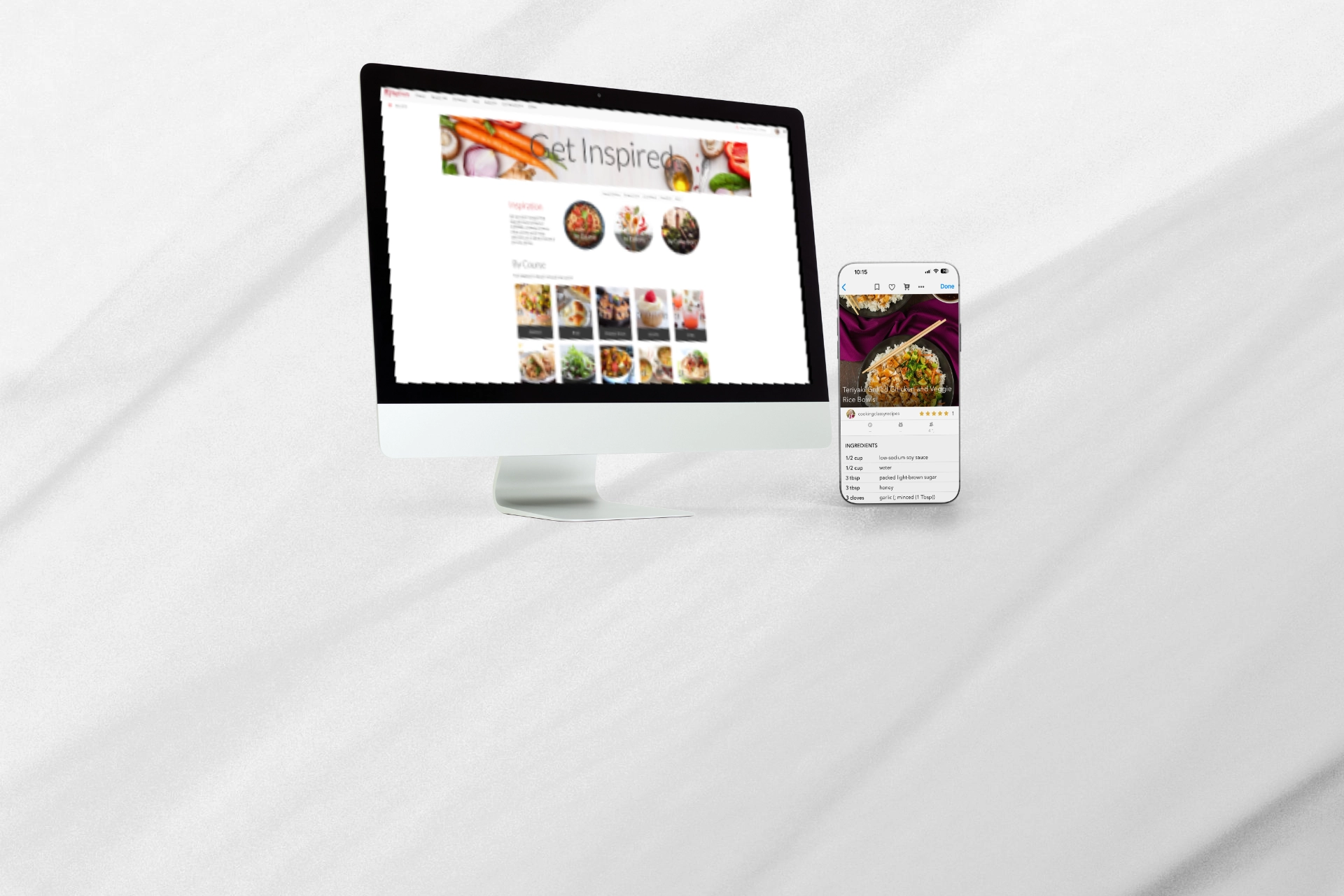
The redesign shared a common structure across web, iOS and Android while adapting interactions to the behaviour of each platform.
04 - Outcome
The redesign introduced a new product direction across responsive web, iOS and Android, bringing greater clarity and consistency to navigation, search and planning experiences. The redesign was presented internally as a broader product proposal and the design work was completed, although it was ultimately not taken into development.