FoodCity
01 - The challenge
Grocery shopping involves many connected activities: browsing products, returning to previous purchases, saving favourites, creating lists and moving toward checkout. These needed to work together without making everyday tasks feel complicated.
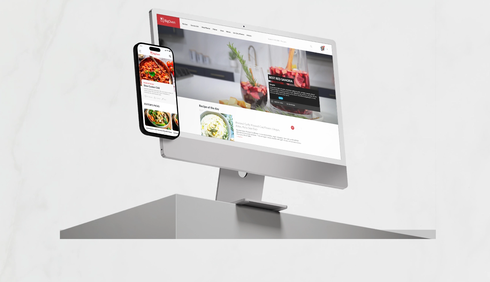
At the same time, the experience had to remain consistent across web, iOS and Android while respecting the behaviour and constraints of each platform.
02 - My Role
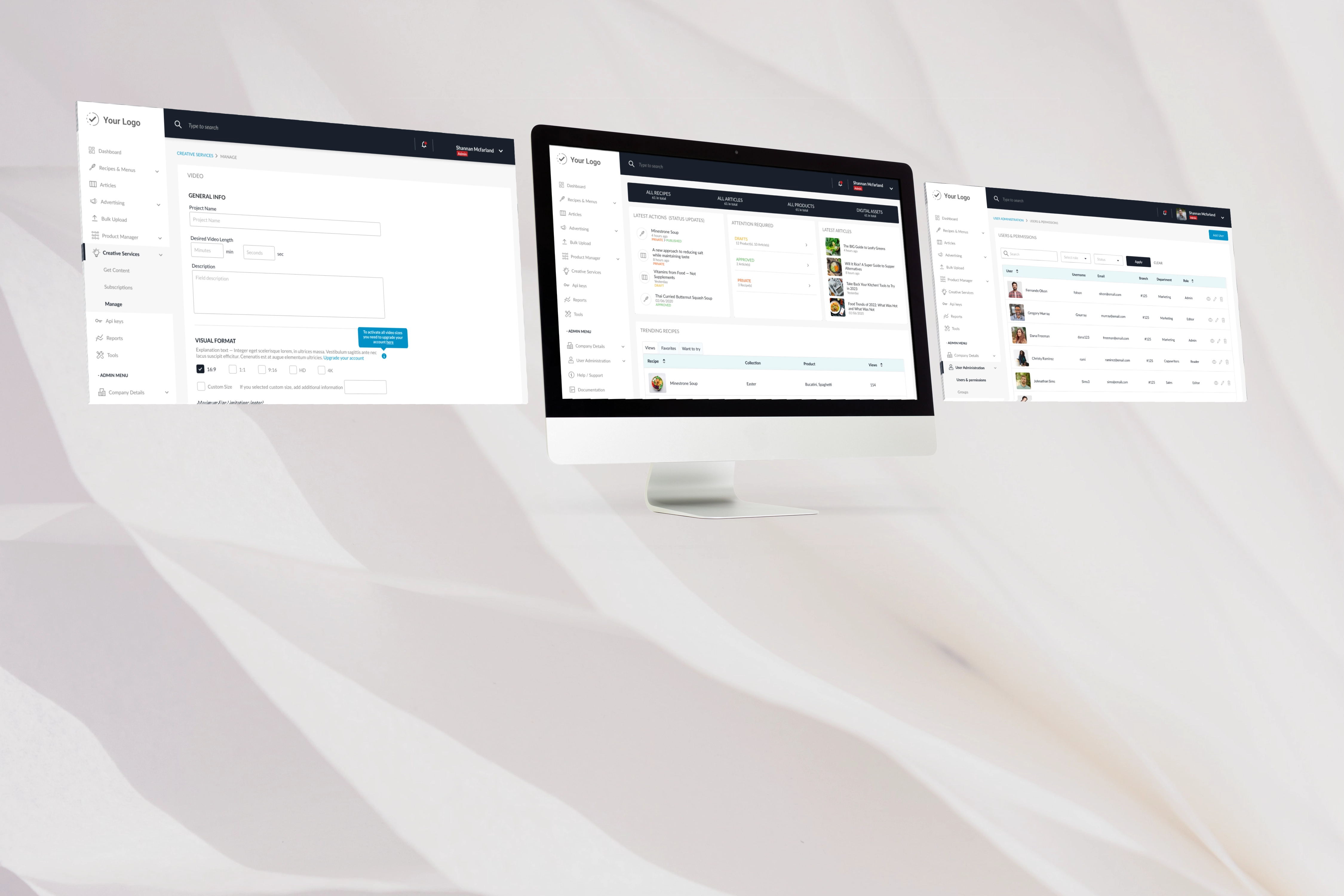
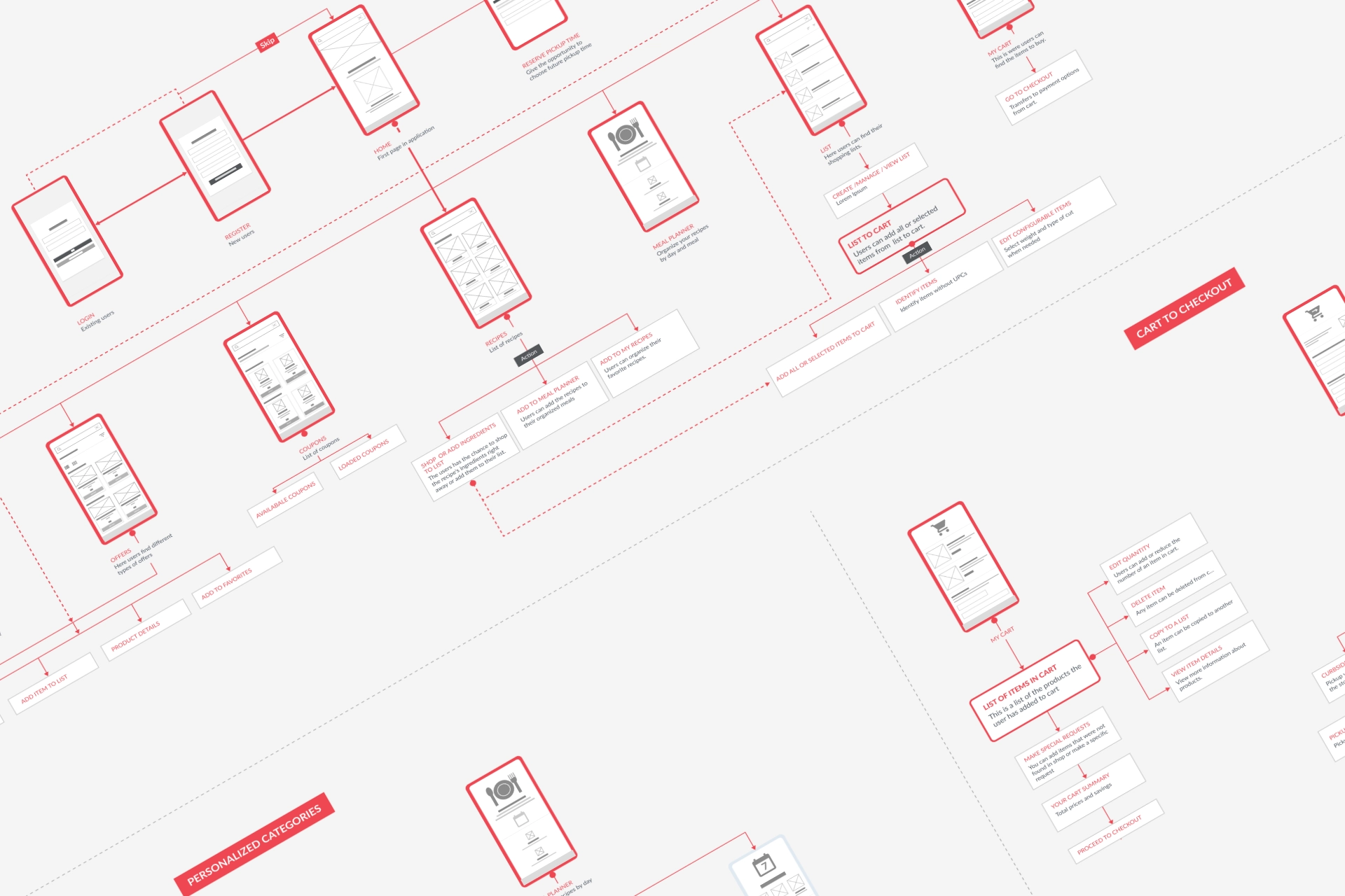
I led the UX and UI design across responsive web, iOS and Android, from user flows and wireframes through interface design, prototyping and developer-ready delivery. I also created and evolved reusable patterns and components, worked closely with development throughout implementation, and reviewed the product as it was built.
03 - Approach and key decisions
Designing around real shopping behaviour
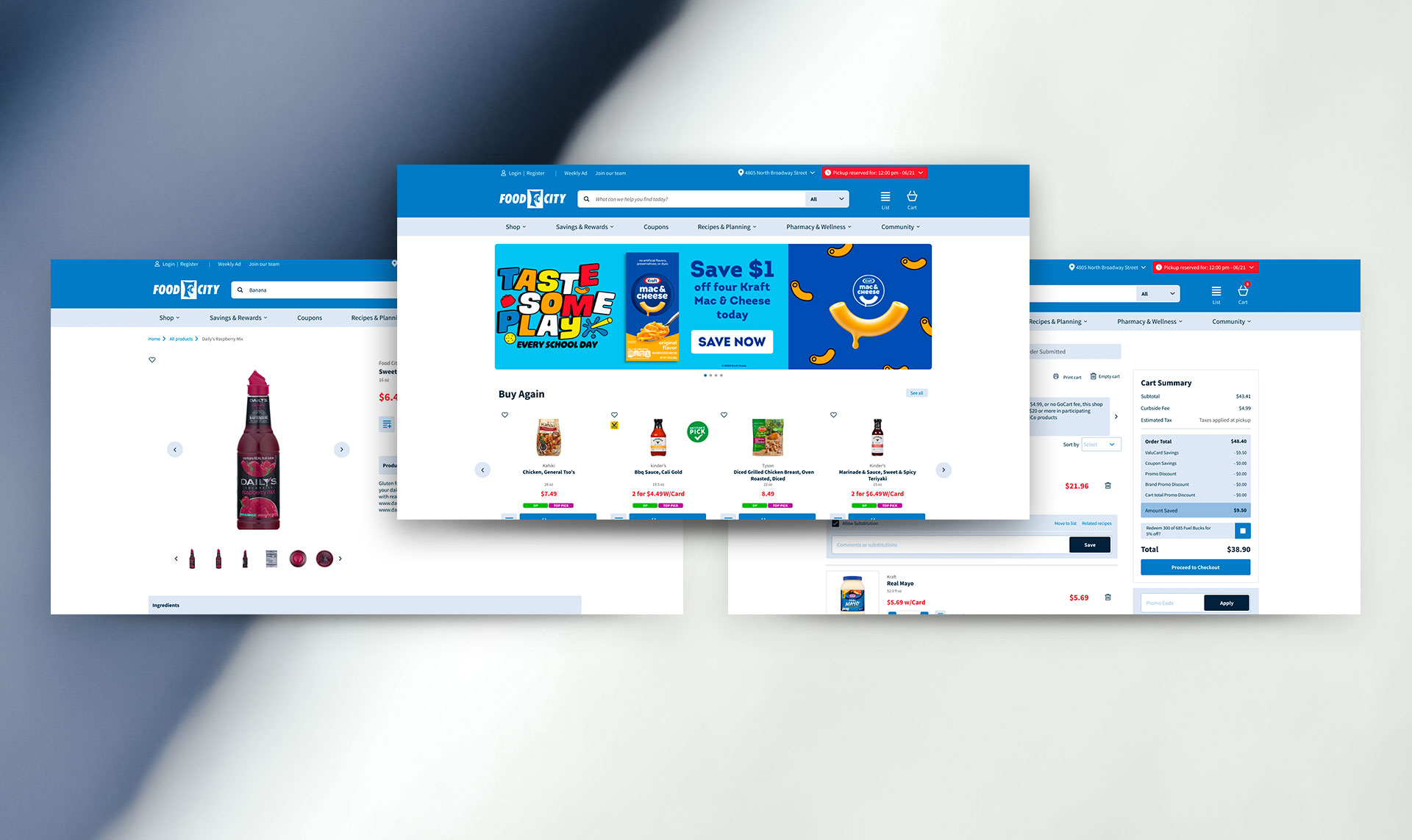
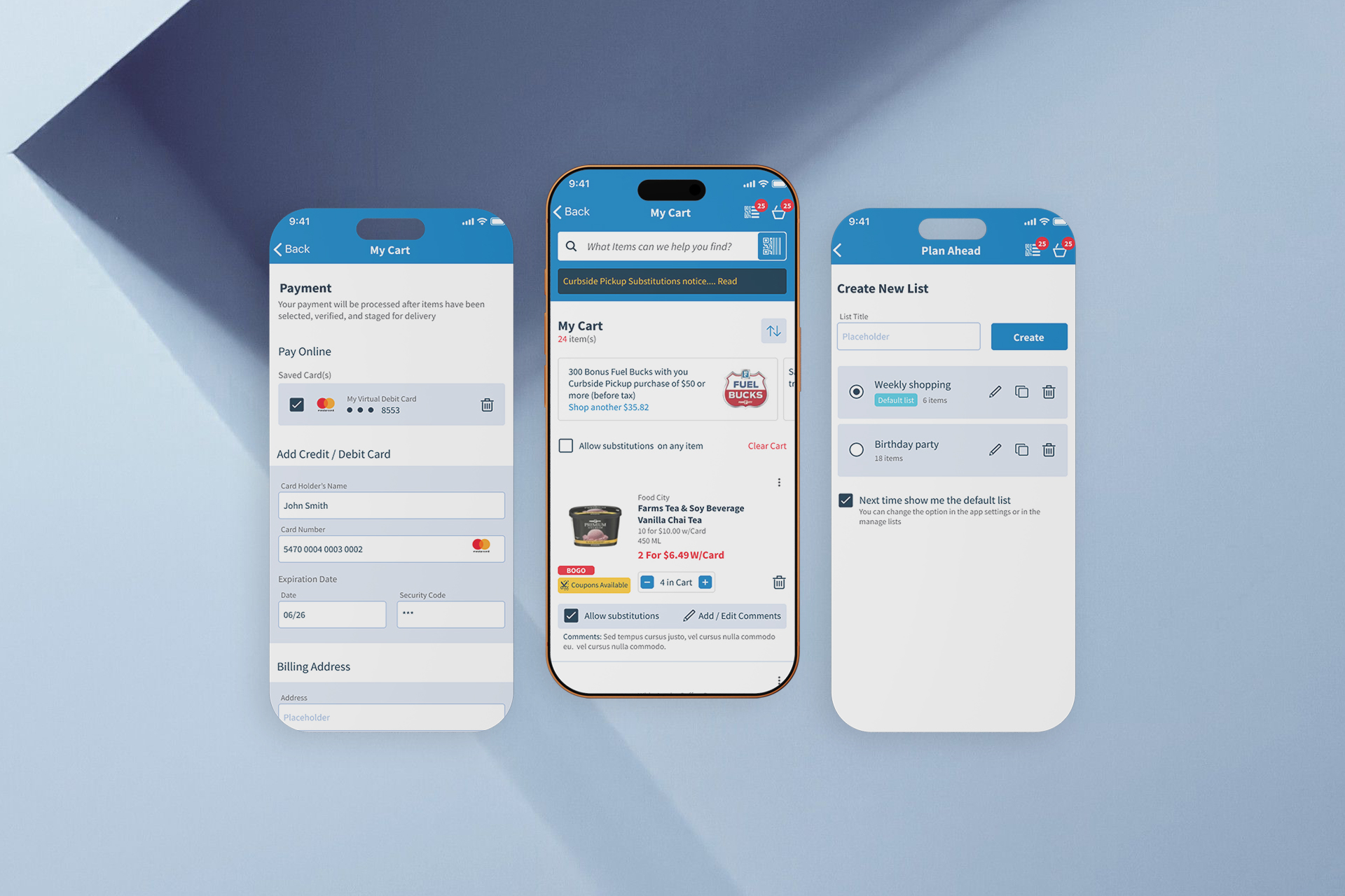
The experience was organised around the activities customers perform most often rather than the internal structure of the business. Browsing, selecting products, managing lists and moving toward checkout were designed as connected parts of the same journey.
Supporting repeat behaviour
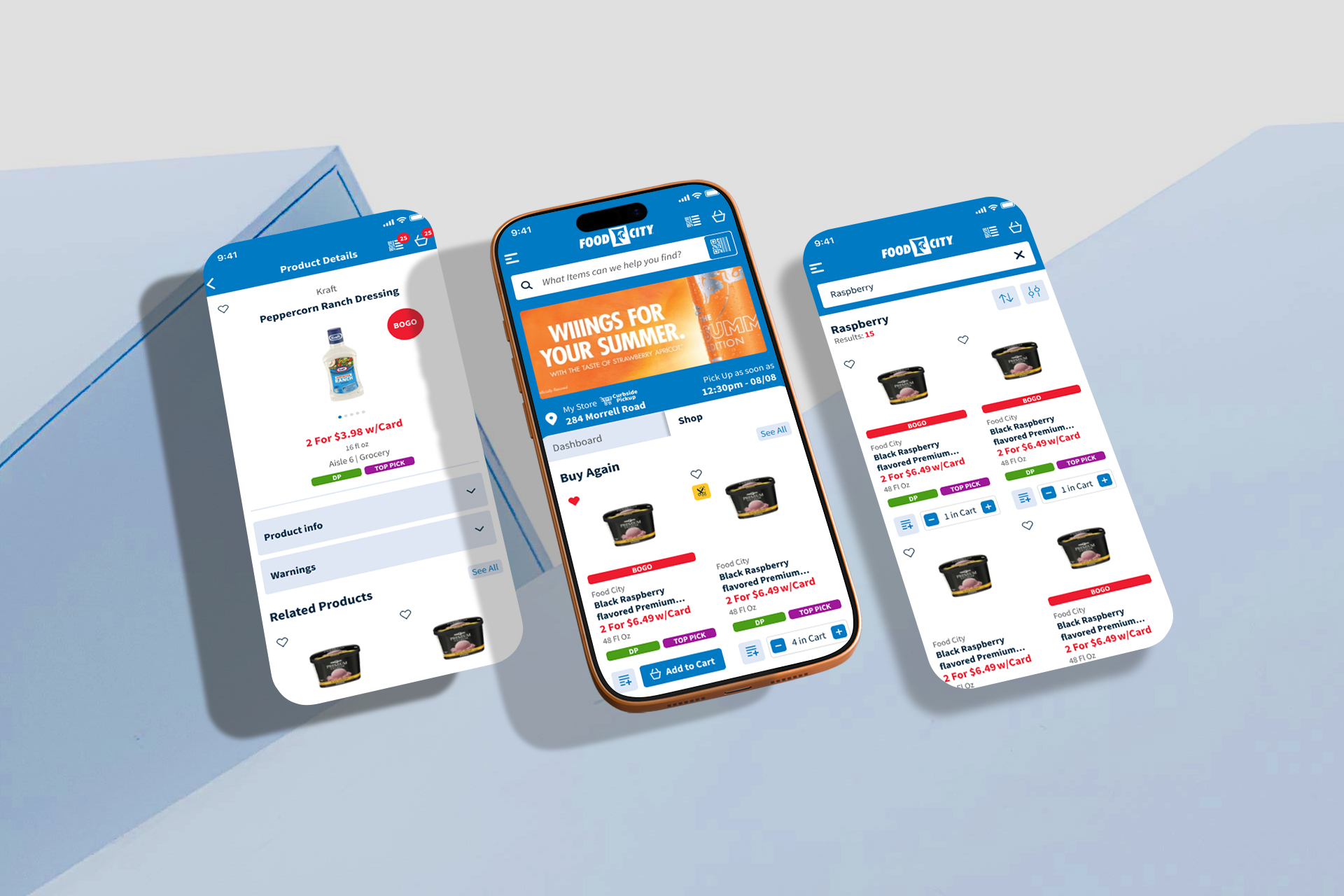
Favourites, previous purchases and saved lists were treated as central parts of the experience rather than secondary features, helping customers return to products and complete recurring shopping tasks more easily.
Creating consistency across platforms
Shared structure, hierarchy and interaction principles helped create a familiar experience across web, iOS and Android, while platform-specific patterns were used where they improved usability.
Building for growth
As the product expanded, reusable components and shared design patterns were introduced and refined to support new functionality and reduce unnecessary differences between screens and platforms.
04 - Outcome & Evolution
The first release established the foundation of FoodCity's digital experience across web, iOS and Android. As the product matured and new requirements emerged, I later returned to lead a broader redesign across all three platforms.
The redesign refined the information structure, interface and interaction patterns based on a deeper understanding of the product and how people were using it. The updated experience was released across web, iOS and Android and continued to evolve after launch.